EHMP
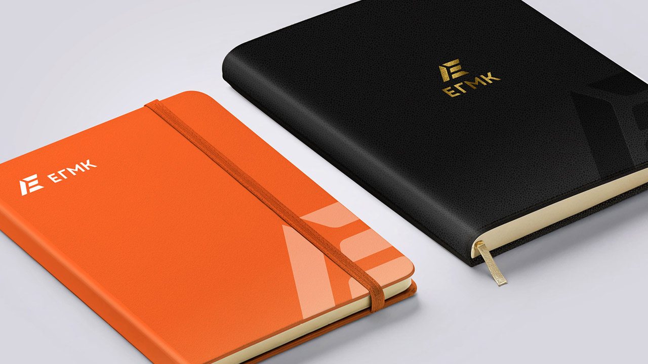
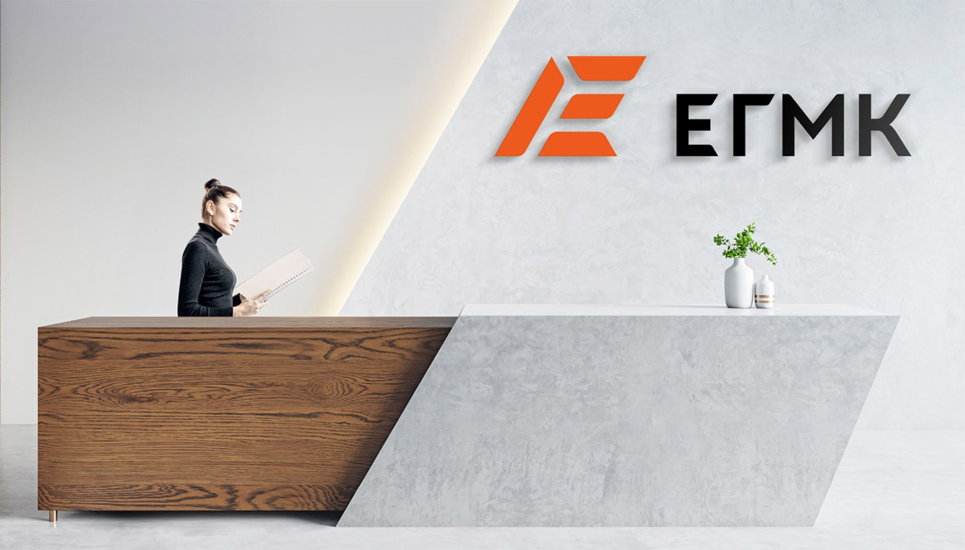
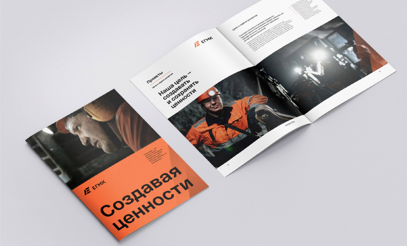
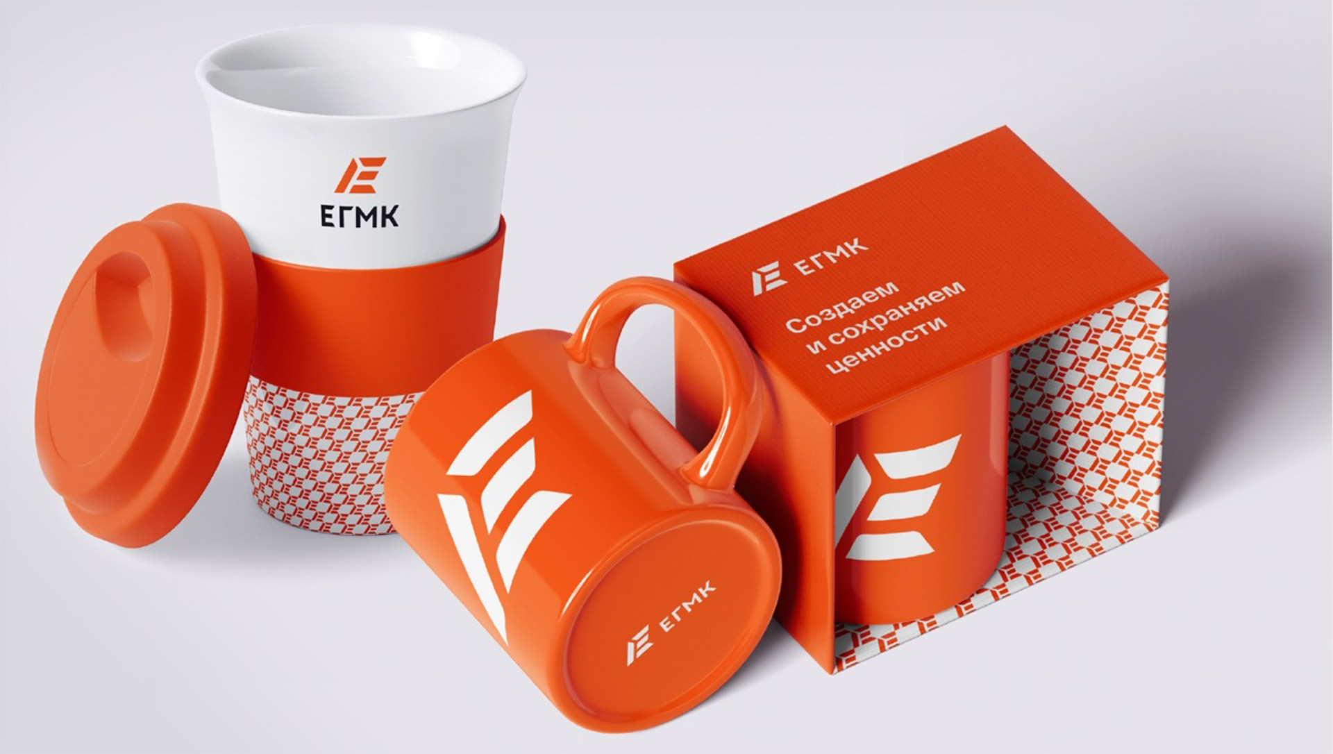
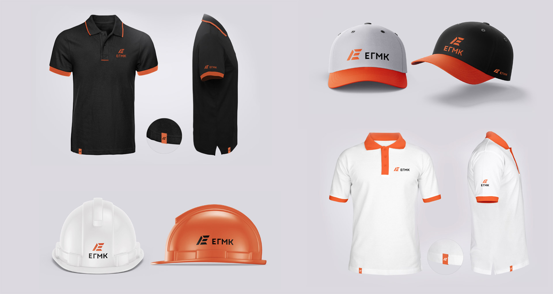
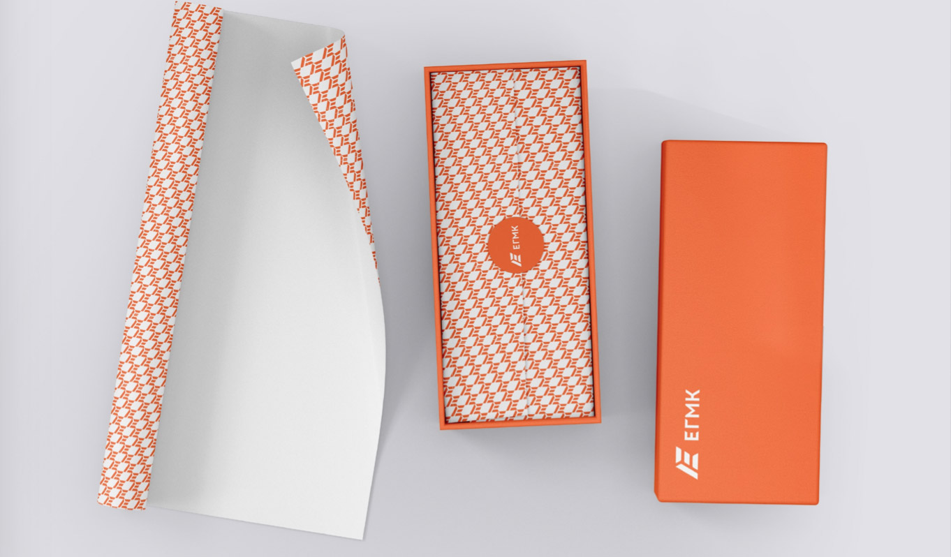
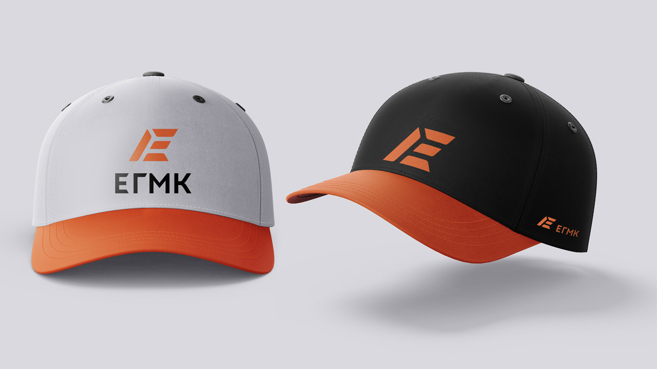


The task was to develop a brand for a gold mining company in Kazakhstan. It was important to maintain the corporate orange color of the main company, SOLIDCORE, but to make the identity more friendly to the public, so that the logo would evoke positive feelings among the people who live in Pavlodar, a region in Kazakhstan.
When designing the logo, we based it on gold bars and the letter E, which is the first letter of the company's name in both Cyrillic and Latin. The logo design is rooted in profound symbolism: gold bars embodying purity and value, and a stylized letter "E"—a universal symbol seamlessly functioning across both linguistic systems. Through comprehensive auditing and in-depth analysis, we crafted a harmonious ecosystem: from a refined logo to dynamic animation revealing the journey from raw ore to refined perfection, and a detailed brand book that serves as the foundation for a unified visual language across all touchpoints.