ORTA
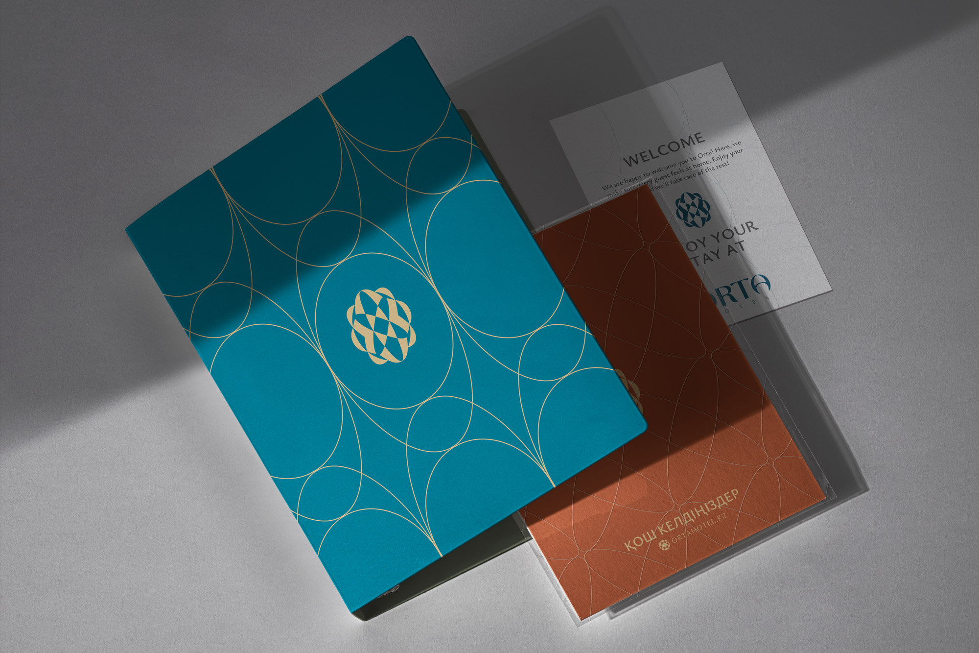
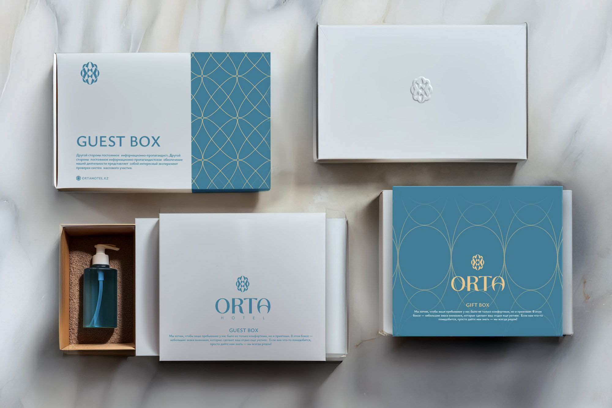
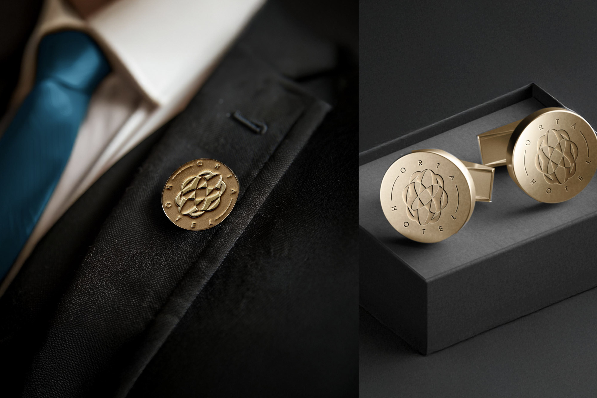
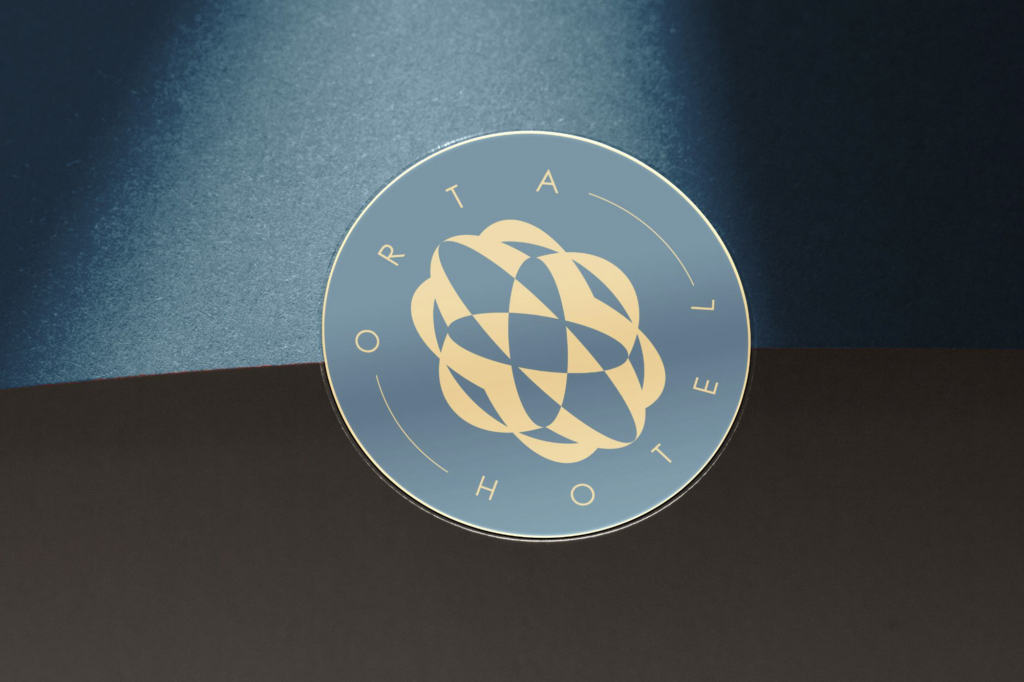


In the heart of Pavlodar, ORTA draws its name from the Kazakh word for “center”. Thus, the symbol in our logo represents the fusion of the yurt’s central dome a traditional nomadic dwelling and national ornamental patterns. The hotel blends local heritage with modern elegance, offering guests an experience rooted in culture, comfort, and connection.
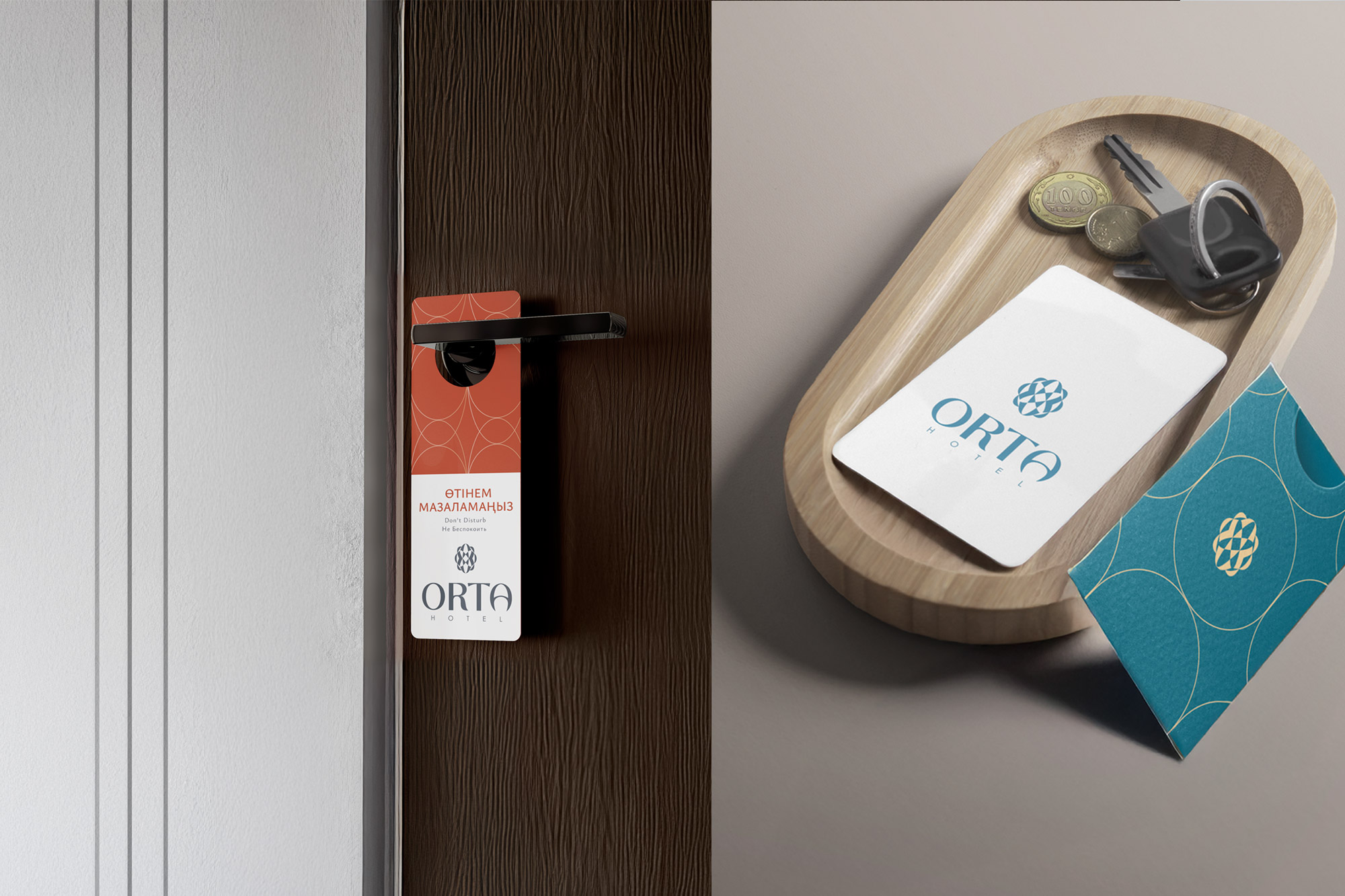
We fully developed ORTA’s brand identity from the logo and color palette to the communication strategy, tone of voice, and creative concepts. We didn't just build a brand; we shaped the entire guest experience. We even collaborated with the architects to help bring the brand's visual language into the interior forms and design, ensuring that every space feels aligned with the story ORTA tells, all while staying accessible in price.
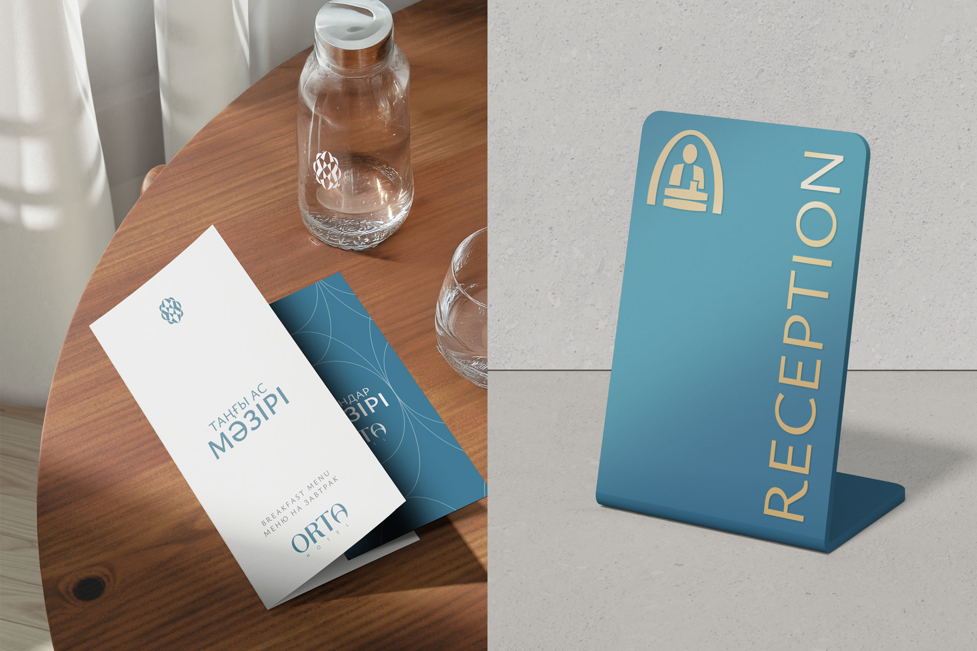
Adding to the complexity was the need to create all communications in three languages — English, Kazakh, and Russian. A challenge we embraced and mastered with cultural sensitivity and creative precision.